
Part 1: Diving into the world of deception
In 2010, I defined a dark pattern as: ‘a user interface that has been carefully crafted to trick users into doing things, such as buying insurance with their purchase or signing up for recurring bills’.
This definition is now a little out of date, and today I prefer to use the term deceptive pattern,1 or to be pedantic, deceptive or manipulative pattern – but that’s a bit of a mouthful, so in this book I’ll use deceptive pattern as a shorthand to mean both.2
At the time, I was probably the only researcher looking closely at the area of manipulative and deceptive user interface design. Now, over thirteen years later, the area has blossomed into a multidisciplinary topic involving numerous human–computer interaction (HCI) researchers, legal scholars and many other people. Of course, I can’t take credit for the work they’ve done; although I launched the initiative and defined a dozen or so of the initial terms, my role since then has mainly been that of an educator, campaigner and amplifier.3 I’ve worked to spread awareness, to name and shame companies, and to encourage legislators, regulators and enforcers to take action.
To understand how businesses can employ design to manipulate users for profit, let’s start with a physical example: travelling through an airport. When you travel through London Gatwick Airport, you’re advised to ‘arrive at least two hours before your flight to allow plenty of extra time to check-in and pass through security.’4 But after you go through security at Gatwick, you’re not allowed to go directly to the departure lounge. You’re forced to do something that has nothing to do with your trip, and it consumes your attention, energy and time. You have no choice in the matter – even if you’re running late.

In the industry, this is known as a ‘forced path’ store layout.5 It’s really just a shop that’s a long, winding corridor, packed into a rectangular footprint in the same way your gut is packed into your belly – travellers are forced in one end and come out the other. The curved path serves a useful function for the business – it forces retail displays into the centre of the traveller’s vision, making it almost impossible for them to avoid looking at the stuff on sale as they navigate their way through the area.6
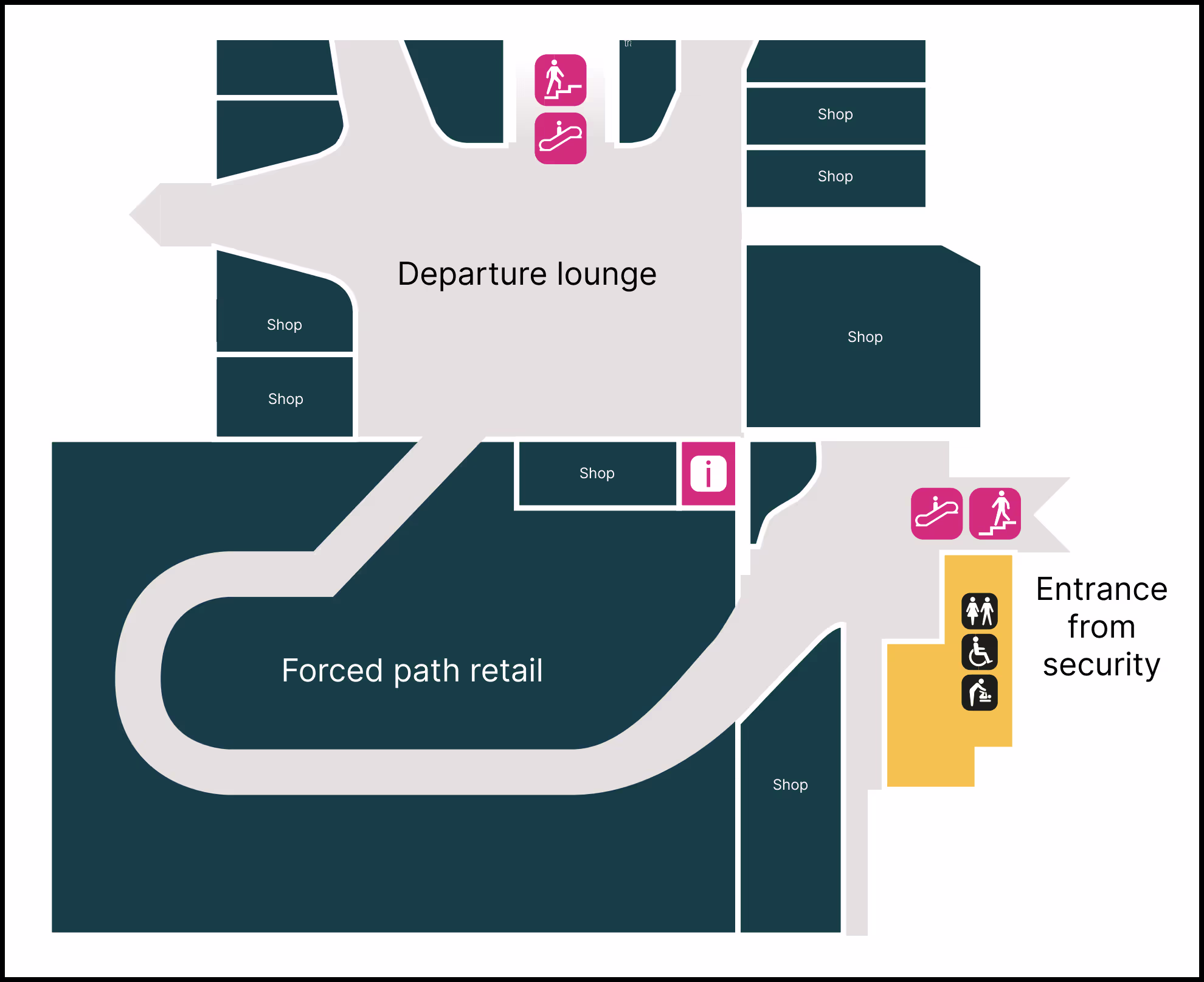
Floor plan of the London Gatwick South Terminal, featuring a mandatory forced path that doubles-back on itself.
Think for a moment about the airline tickets and legal terms. In those documents, there’s nothing mentioned about requiring you to spend time in a retail area looking at perfumes, beauty products and alcohol before you’re allowed into the departure lounge. And consider the airport’s guidance – to arrive at least two hours before your flight. If time efficiency really was their top priority, they wouldn’t impose the forced path retail store as a mandatory step between security and the departure lounge.
This is a good example of how businesses can use design to coerce and manipulate you. Arguably, it’s also slightly deceptive in the way that the business is fully aware of the revenue-generating purpose of the forced path store, yet they don’t mention it when they ask you to arrive two hours early, and they don’t give you a shortcut to skip it.
In this example, the negative impact on travellers is minor and not particularly harmful; it’s more of a nuisance than anything else. But when you consider the fact that over 40 million people travel through Gatwick every year, you can see why it’s designed this way.7 If this manipulative design can get just a few percent of travellers to make a purchase who would not otherwise have done, the airport can charge a huge premium on the lease for that retail space and enjoy a lucrative relationship with the retailer.
It’s even easier to build manipulative and deceptive experiences online, because the designer has so much more within their control. When everything is virtual, anything can be tweaked to increase profitability. Here’s a simple example of a deceptive pattern on a website. You’ve probably run into something like this yourself before when signing up to something:8
![A sign-up form with the following questions and optional answers: “WIRED and Conde Nast would like to contact you with offers and opportunities. Please tick here if you would prefer to receive these messages: by email [tickbox], by SMS [tickbox]”; “If you do not want to hear from us about other relevant offers, please tick here: by post [tickbox], by phone [tickbox]”; “Our partners sometimes have special offers that we think you will find relevant, please tick here if you would prefer to receive these messages: by email [tickbox], by SMS [tickbox]”; and “Please tick here if you would prefer not to hear from our partners: by post [tickbox], by phone [tickbox]”.](/book-images/image52_1.avif)
Did you see the trick? There’s a switch in the wording between each line of checkboxes. If you tick the boxes in the first row, you’re opting in to messages. In the second row, you tick them to opt out. Third row is opt in again, and fourth row is opt out. If you want to opt out but you’re not paying attention, chances are you’ll misunderstand at least one of the rows and end up getting spammed. This trick enabled Condé Nast to send out more marketing messages, which meant more ‘eyeballs’ – more people seeing the information – which in turn meant more sales and more profit. If you live in the EU or the UK, you probably haven’t seen this type of deceptive pattern recently because it became illegal under the General Data Protection Regulation (GDPR)9 a few years ago.10 Hooray for progress!
Part of the inspiration for my work on deceptive patterns came from an interest in design patterns. A design pattern is a common and reusable solution for a problem when you’re building user interfaces (UIs). For example, if I told you to close your eyes and imagine the sign-in box for a website, you’d probably see the same thing in your mind’s eye as I do – a text field where you’d type your username, a password field below it, some kind of button that says ‘sign in’ and a link that says ‘Forgotten password?’. That’s a UI design pattern. Different industries have their own design patterns, and the idea originally comes from architecture in the built environment.11
Another well-known idea is the antipattern: a common mistake when trying to solve a problem. But as I sat there, back in 2010, doodling in the margins, I realised there was another type of design pattern that nobody was talking about. It wasn’t about recommended practices or mistakes to avoid – it was about manipulative or deceptive practices that benefit the businesses that employed them and harmed the users who fell victim to them.
Although it’s taken a long time, this area of work is finally achieving a breakthrough as new laws emerge. We now have the EU GDPR, Unfair Commercial Practices Directive (UCPD), Digital Markets Act (DMA),12 Digital Services Act (DSA),13 the proposed EU Data Act,14 the California Privacy Rights Act (CPRA),15 and the Colorado Privacy Act (CPA).16
The CPRA and CPA both use the same definition: ‘dark pattern means a user interface designed or manipulated with the substantial effect of subverting or impairing user autonomy, decision making, or choice’.
Central to this definition is the concept of autonomy – for a user to be able to act according to their own goals, free from external influences, while understanding the nature of their choices. For example, if a user is tricked into sharing personal information because the legal agreement was completely hidden from them, then by definition there is no agreement: the user was denied their autonomy, since they were not free to become informed and make their own choices. However, the CPRA and CPA only cover privacy. The United States doesn’t yet have any state or federal laws that directly address deceptive patterns beyond privacy. The EU is slightly ahead in this regard, with the much broader Digital Markets Act and Digital Services Act coming into force in 2023. The DSA uses the following definition (Recital 67):
‘Dark patterns on online interfaces of online platforms are practices that materially distort or impair, either on purpose or in effect, the ability of recipients of the service to make autonomous and informed choices or decisions. Those practices can be used to persuade the recipients of the service to engage in unwanted behaviours or into undesired decisions which have negative consequences for them.’
As you can see, the DSA’s definition is similar to the CPRA and CPA. It’s about not interfering with users’ autonomy, choice and decision-making.
There are a few different ways to think about deceptive patterns, and the legal perspective is just one of them. For example, if your background is UI design or engineering, you may be more interested in the mechanics of how they’re put together. If you’re coming from psychology or HCI then you may be more interested in how they prey on the human mind. If you’re an ethicist then you may be interested in the broader philosophical implications. In the coming chapters, this book will touch on each of these perspectives.
My main point here is that deceptive patterns are not just a niche curiosity anymore. If you work in the tech industry you need to understand them, particularly since some types are already illegal, with even more activity coming from lawmakers, regulators and enforcers.17
Before we go much further, you’ll need an understanding of how the design industry has evolved too.