
Chapter 14: Sneaking
In the ‘reverse pyramid’ style of writing, we are taught to be helpful to the reader by starting off with a short summary of what’s to come, followed by progressive layers of detail. The idea is that this enables the reader to stop reading at any time and still have an accurate impression of the article. If you want to manipulate the user, you can do the opposite and sneak key information into long paragraphs or poorly labelled sections, so that readers are unlikely to expect it or seek it out. With user interface design, there are many more opportunities to use sneaking, given all the different forms of interaction available: scrolling, progressive disclosure (where the user can click or hover to reveal content on the page), links, buttons, and so forth.1 In commercial transactions, it can be profitable to hide information, as you can see in the three types of the sneaking deceptive pattern explained below.
The sneak into basket deceptive pattern
There are several different ways an online retailer could sneak things into a customer’s basket. The most brazen approach is to just put it in without mentioning it, and hope the customer either doesn’t notice or doesn’t care enough to complain. It’s also possible to use misdirection and other deceptive patterns to trick users into inadvertently adding items to their basket themselves.
Sneak into basket by Sports Direct: an unwanted £1 magazine
A few years ago, Sports Direct was famous for its giant promotional coffee mugs that everyone in the UK seemed to have in their kitchen cupboards. Let’s look at why. Below are screenshots of the sportsdirect.com website taken in 2015.
Let’s imagine I’m happily browsing the website, about to buy a pair of walking boots. As you can see, there’s nothing weird going on. It’s just a regular shopping page.2
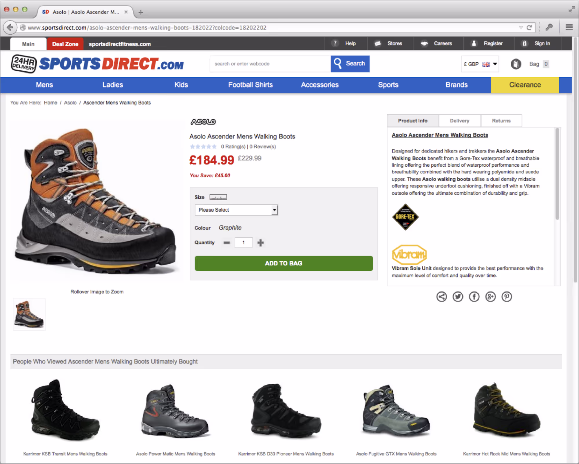
Now, let’s say I want to buy these boots. I choose my size, click ‘add to bag’ and then proceed to the checkout.3 See anything strange?
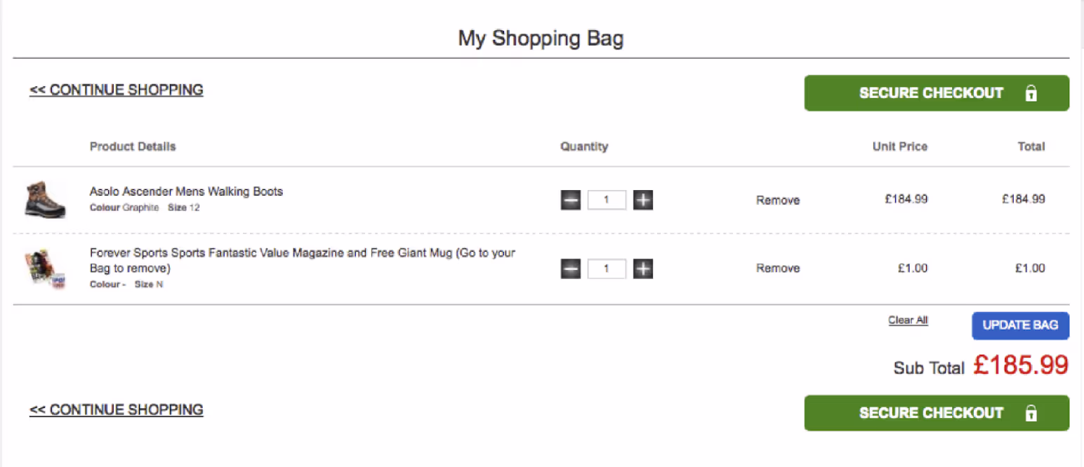
In a line below the walking boots, there’s now an item that I didn’t put into my own shopping basket: a magazine and mug together for £1. Sports Direct was called out for this on Watchdog, a popular BBC consumer rights TV show in the UK. In 2014 this practice became illegal in the EU, thanks to the Consumer Rights Directive.4
The hidden costs deceptive pattern
The practice of introducing hidden costs (also known as ‘drip pricing’5 or ‘bait and switch’6) involves intentionally introducing a price increase that the user isn’t expecting in the buying journey. More often than not, this manifests as unexpected fees and charges on the final checkout page, immediately prior to paying.
Hidden costs by StubHub
An excellent example of hidden costs was published in a research paper written by researchers Blake et al. in collaboration with StubHub (the entertainment ticket reseller) in Marketing Science journal in April 2021.7 The paper is well worth reading, since StubHub seemed to be strangely proud of their own deceptive practices. Be warned though, the paper does use euphemisms extensively. For example, instead of talking about hidden costs, it refers to ‘back-end fees’.
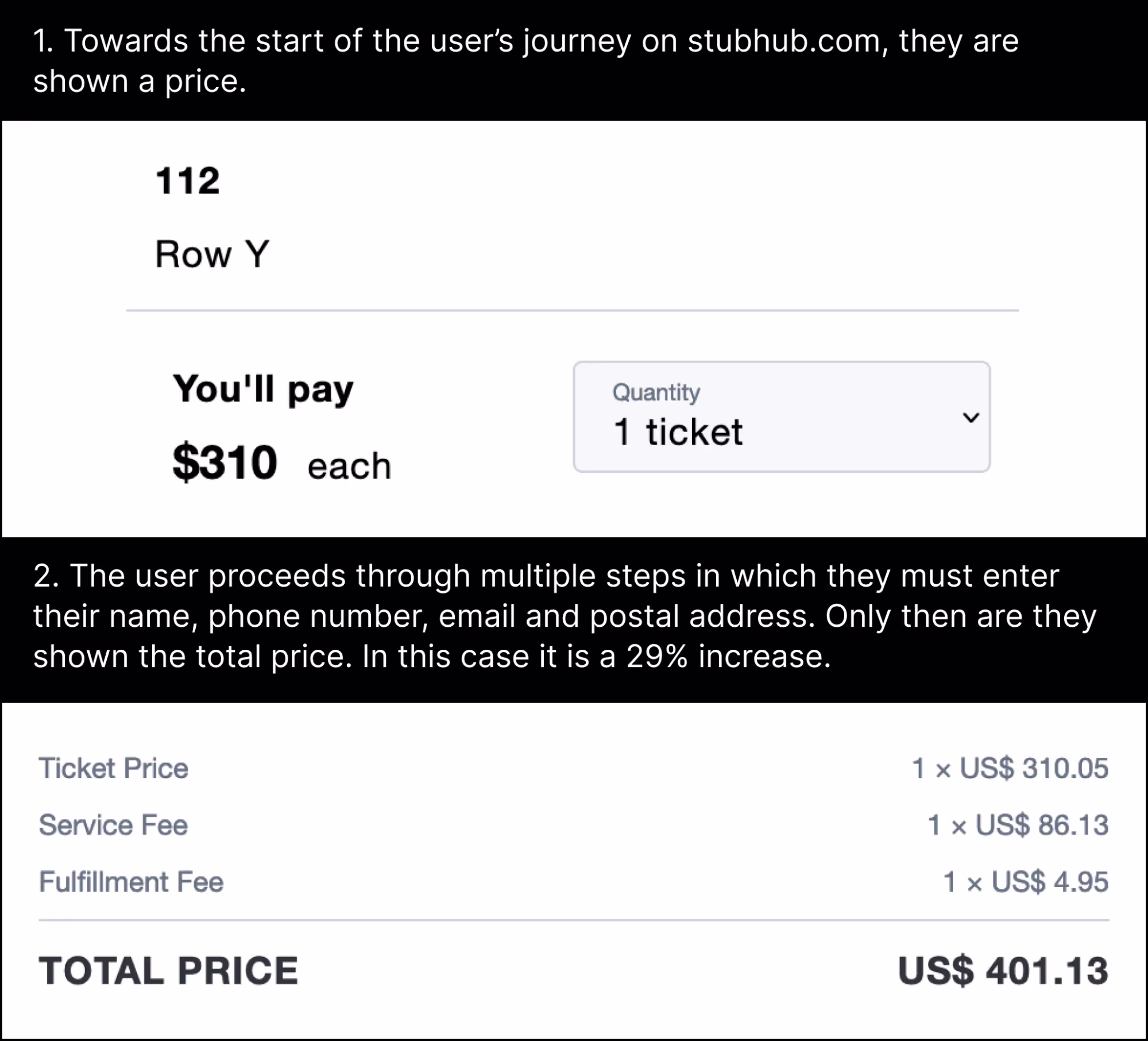
Here’s a visual example of the StubHub user experience. To summarise, the price you see at the beginning of your shopping experience is lower than the price you see at the end; and that’s after you’ve been forced to input your full name, phone number, email and postal address.8
In their research, Blake et al. did an A/B test comparing (A) a design that used hidden costs that were only revealed at the very end (see above) against (B) a design that showed accurate costs at the very start of the user journey. They collected data from several million transactions and it’s probably the largest A/B test of deceptive patterns ever published.
Guess what happened. The users in group A who weren’t shown the ticket fees upfront spent about 21% more money and were 14.1% more likely to complete a purchase. That’s huge.
So, now imagine what it would be like to run a business and know that one simple design decision would get your customers to spend 21% more. It’s a no brainer – of course you would. One of the only things that would stop you is the threat of legal consequences that would cost more than the profit you’d get from it.
Hidden costs by Airbnb
Resort fees, amenity fees, destination fees and cleaning fees have been common in the hospitality industry for a while. In 2019 Marriott charged cleaning fees of up to 55% of the listed booking price.9 This behaviour led to them being sued, and the ensuing legal process revealed some staggering internal documents. Marriott knew from its own internal market research that guests were very concerned with the ‘lack of transparency’ in fees, but they proceeded with it anyway, earning more than $220 million from this practice. An audit also revealed that 33% of the time, resort fees were not shown at the time of booking – the customers only learned about them afterwards! Marriott eventually settled and the company does not engage in this practice any more.10
It’s not a great case study without any visual examples, so let’s move on to Airbnb. For some time now, Airbnb customers have complained on Twitter about additional fees, as you can see below.11
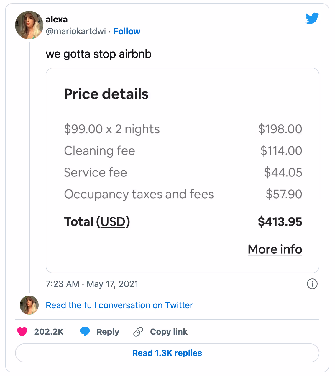
The key question here is whether the fees were hidden at the outset of the user’s journey, or whether users like alexa (above) were told in advance but were just unhappy about the high price. The specifics are a little hard to pin down, since Airbnb runs different versions of its user interface in different countries, and it makes regular changes over time. However, these screenshots show what it was like in the United States, around June 2021.12
In the screenshot below, you can see a user has selected to travel to Mexico City between 13 and 16 July with two guests. You can see on the map there’s a range of different apartments at different prices. Let’s imagine that the user selects an apartment at $87/night, since it matches their budget.
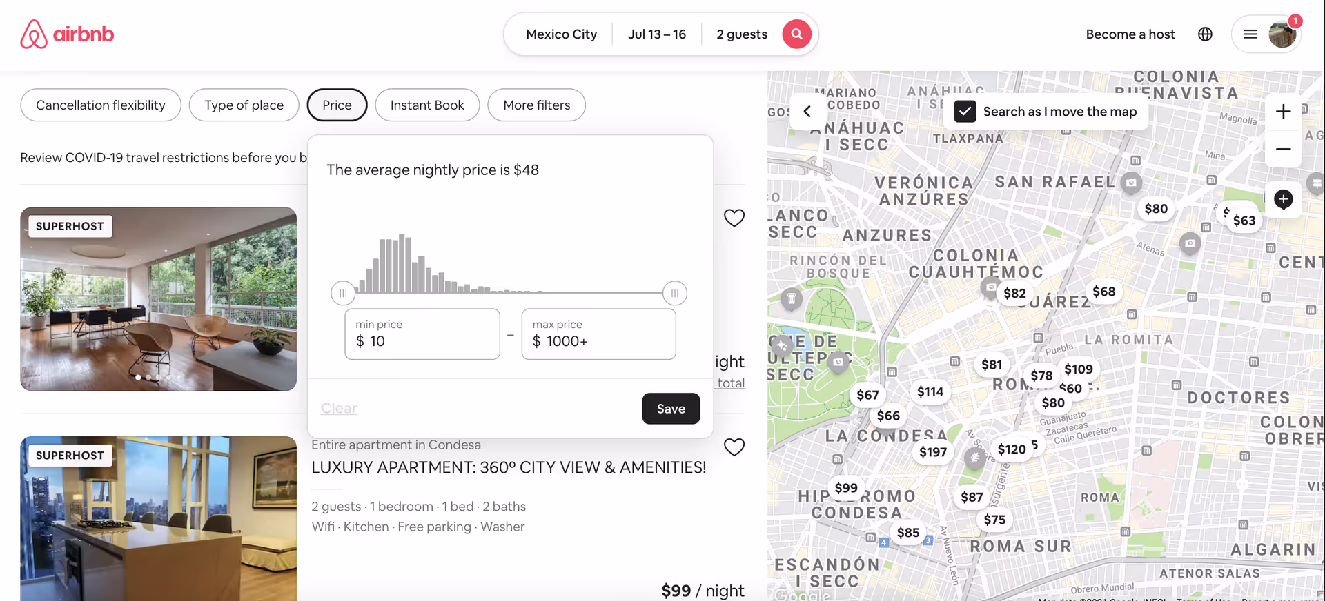
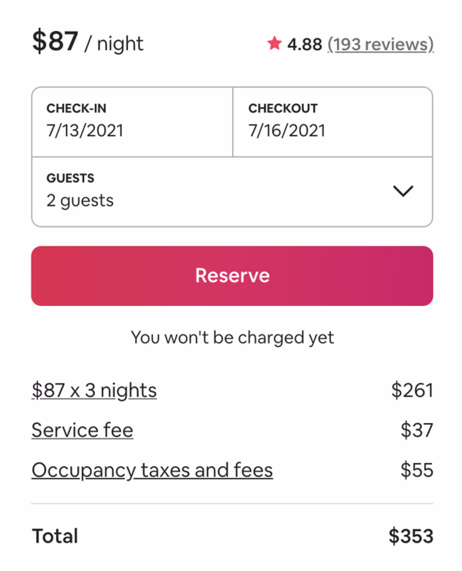
When the user selects the $87/night apartment, they are taken to the listing details page, shown below. All of a sudden, some additional fees have appeared – a ‘Service fee’ and ‘Occupancy taxes and fees’. This makes the per night cost 35% higher than indicated on the previous page.
This approach to hidden costs led many users to complain on social media, though notably only in some countries and not others.13 For example, Airbnb users in Australia do not get tricked with the hidden cost deceptive pattern because their regulator, the Australian Competition and Consumer Commission (ACCC) forbids it.14 Similarly, Airbnb was pressured by the Norwegian Consumer Authority and the European Commission in 2019, and it has since given up doing it in Europe.15 It’s interesting to consider how international tech companies vary their use of deceptive patterns by legal jurisdiction. By deduction, the deceptive practices must be profitable enough to continue running in countries where the businesses believe the risk is worth taking, while they turn them off in countries where the regulatory outcome would be too expensive or disruptive. Among other things, this is a very clear sign that regulation works.
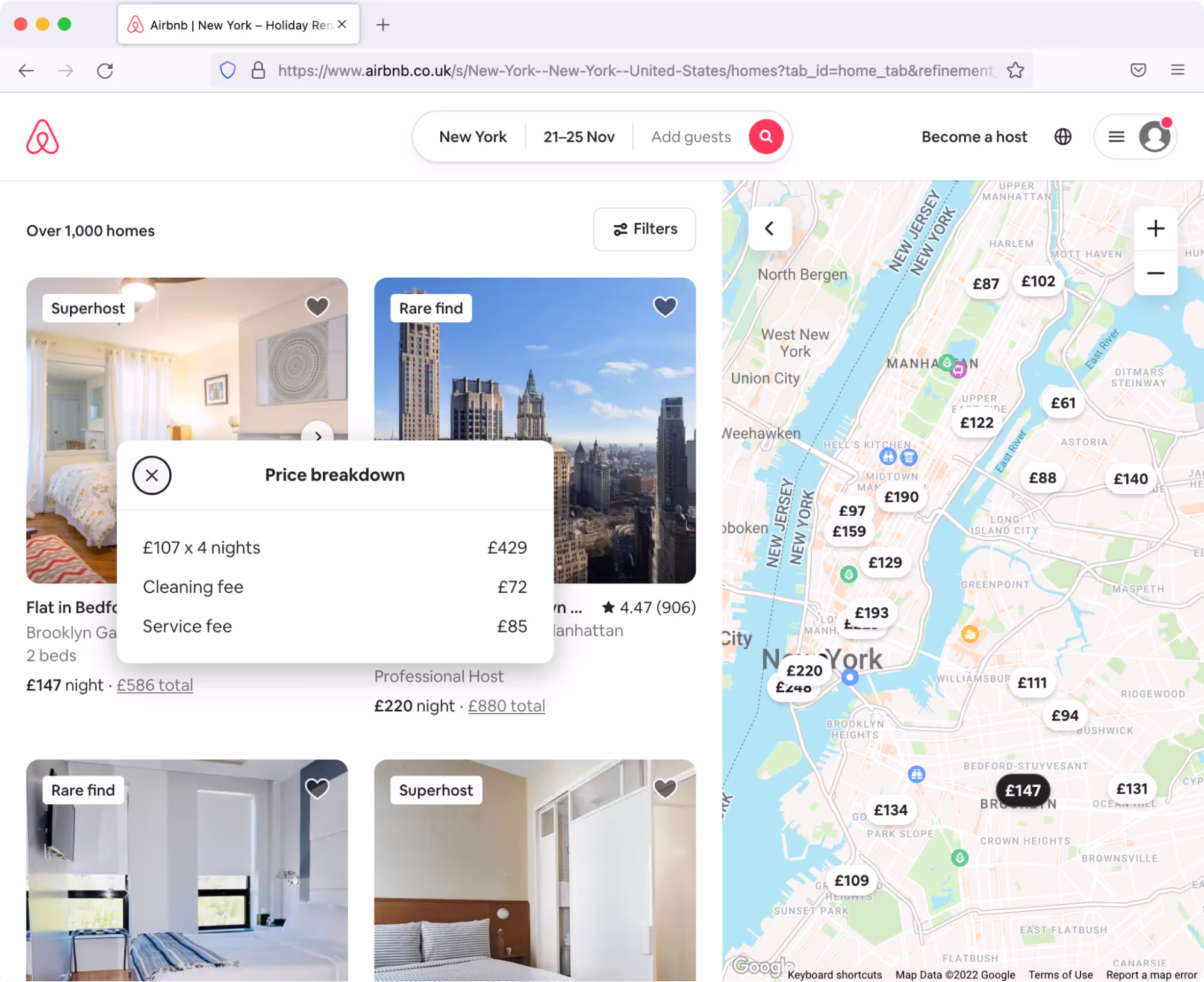
If you look at airbnb.co.uk today, you’ll notice that it has become more transparent with its pricing. When you arrive on the homepage, it defaults to ‘any week’ in the search area, and the listings are shown on the basis of seven nights, allowing them to calculate the total cost and show it directly as the first price you see.16
Furthermore, if you select your own dates and do a search on airbnb.co.uk, you’re clearly shown the total price and the per night price. If you click on the total, a small pop-over appears that shows a price breakdown. Bravo, Airbnb. Now do it worldwide.17
The hidden subscription deceptive pattern
Hidden subscription by Figma
If you’re a designer, you’ve probably heard of Figma. It’s a collaborative UI design tool used widely in the industry. When you create a design in Figma, you can share it with other people by clicking the helpful blue ‘Share’ button at the top right of the screen, as shown in the figure below.18
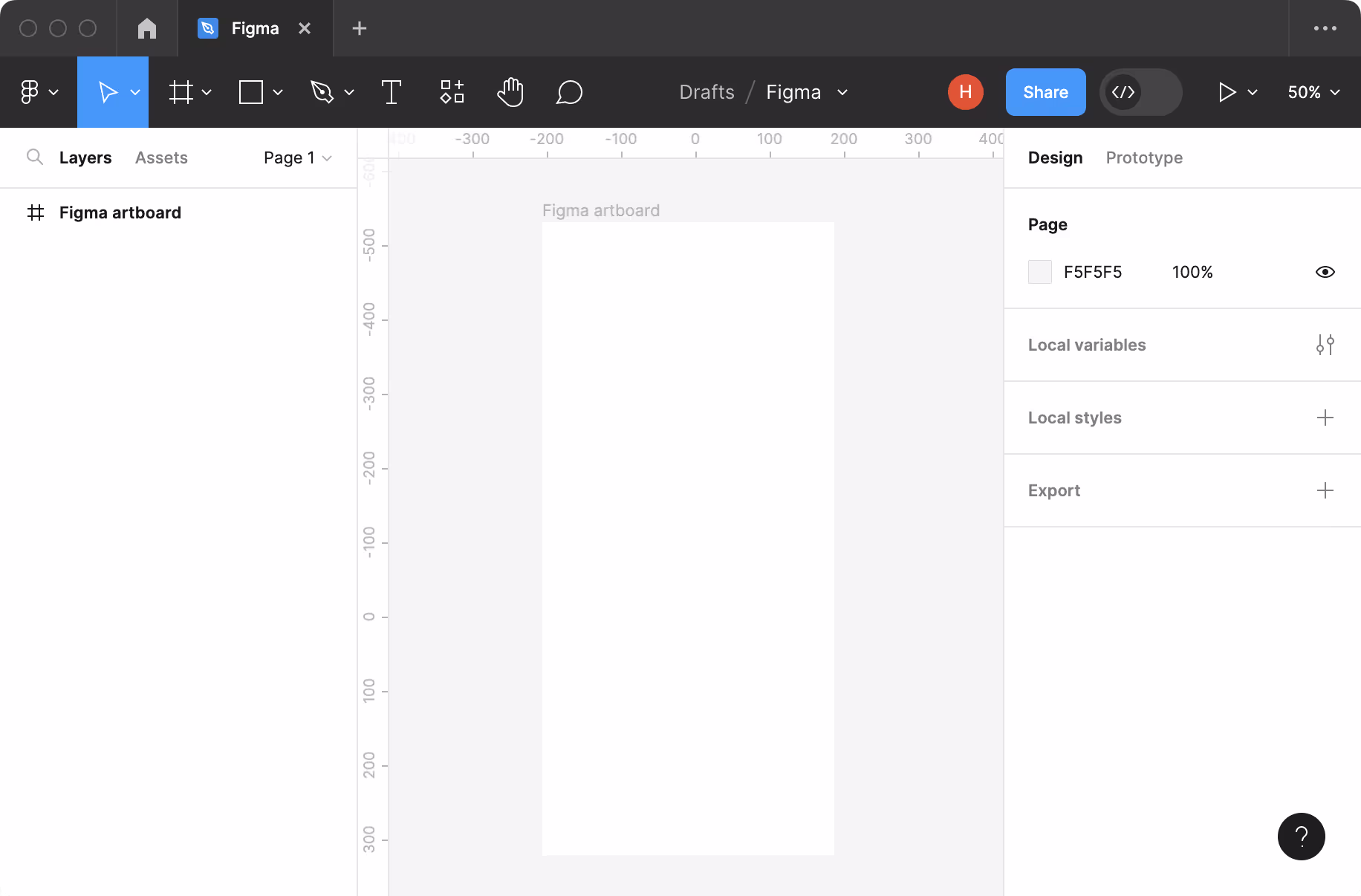
Clicking the blue ‘Share’ button causes a dialog box to appear, which lets you send an invite to another member of your team, or a colleague, or anyone really. From that point, you can then decide if the lucky recipient ‘can edit’ or ‘can view’, as shown in this screenshot.19
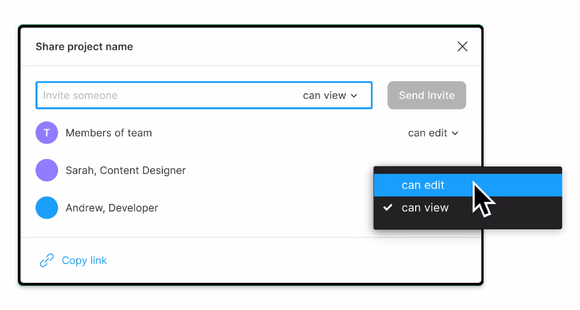
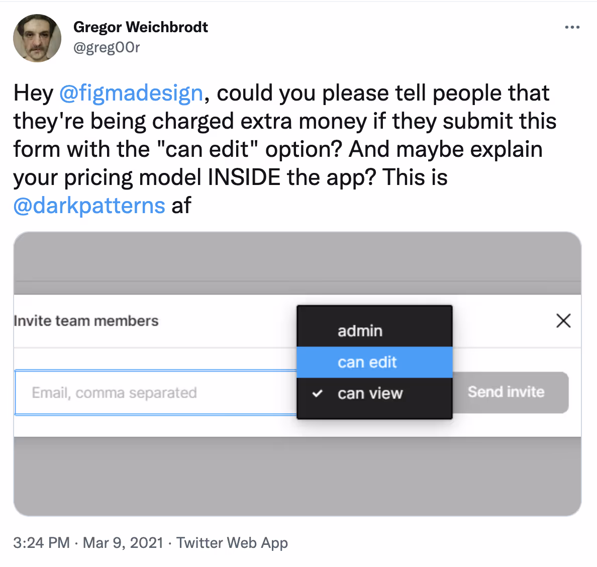
This looks innocent enough. Helpful, you might say. But, as Twitter user Gregor Weichbrodt pointed out in March 2021, if you pick the option ‘can edit’, then, in the background, this creates a new monthly subscription for the invitee – which you pay for on your credit card. This extra cost is not mentioned in the user interface, anywhere. Since Figma already has your credit card details on file, it’ll just start charging you immediately, without any emails or other notifications.20
If you don’t pay attention to bills, this sneak into basket deceptive pattern means you end up paying for additional subscriptions that you didn’t intend to buy. Think about this for a moment: if you’re a large design agency, working with multiple external clients and multiple teams and freelancers, then the risk of being caught out goes up almost exponentially.
Any team member with an editor account can unwittingly create new subscriptions with the ‘can edit’ option. Those who receive those invitations can then send their own invitations. As most of the design team is unlikely to see the credit card bills or invoices, and the accounts team may have no reason to challenge the costs being incurred by the design team, your business remains ignorant of the fact the monthly subscriptions are going up, every time someone chooses that option.
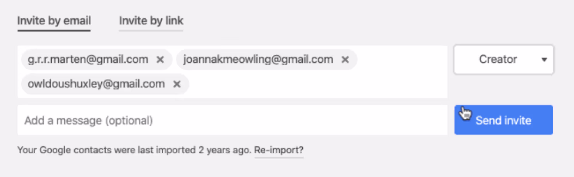
It’s not clear who copied whom, but airtable.com and figma.com both use the same deceptive pattern. When users click ‘Share’ in Airtable, they’re taken to a dialog box that’s very similar to Figma’s (see below). Note that there is no text on this page that explains how clicking ‘Send invite’ may incur an ongoing subscription fee for each individual added.21
As you can imagine, this user interface results in some huge unwanted charges, as you can see in this complaint on Twitter by @harper:22
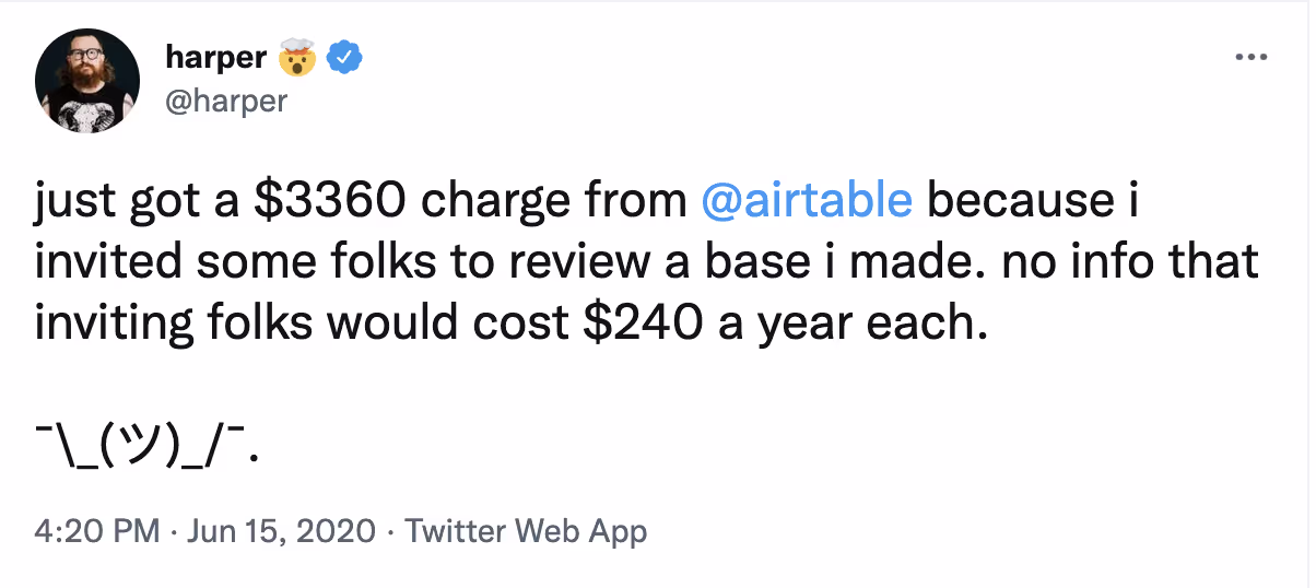
If you send the Airtable invite to people with ‘editor’ or ‘creator’ selected, then your credit card is automatically – and silently – charged. There’s no explanatory text on the page, no warning, no notification. As with Figma, the first time you find out about the extra charges is after you’ve paid them.